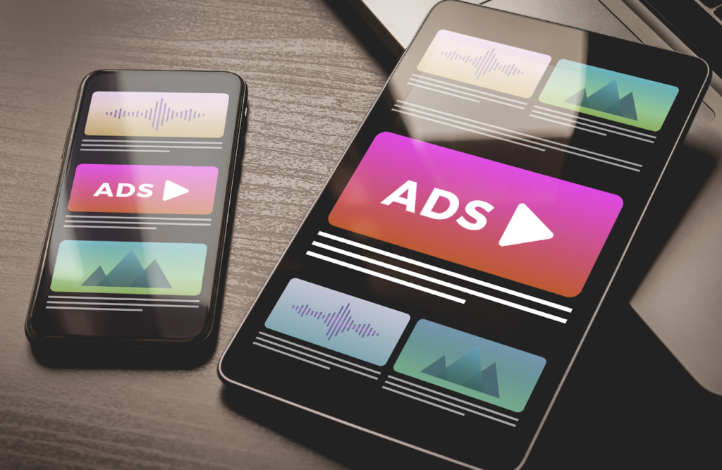
When you are marketing for your brand, there are multiple ways to go about it. You may run a social media ad campaign on Facebook and Instagram, displaying compelling digital ads. On the other hand, you may want to set up a billboard on the side of a busy freeway to target a specific area. The difference in these types of ads is whether the final design will be printed or shared digitally. Despite what some may think, there are a lot of factors to consider when you’re creating a design for print vs. digital.
Layout:
The layout is a huge factor between designing printed ads vs. digital ones. When designing digital ads, you may have more flexibility in how much information you can feature on the ad. You can also play around with animations and advertising videos, which can give more dynamic and insightful information to your viewers.
For printed ads, there are a lot more factors to consider when creating your design. For example, if you’re designing an ad for a billboard, you want to make sure that your design is clear and to the point. Any unnecessary information is going to make the design look busy. Drivers passing by your billboard are only going to have a few seconds to absorb your ad, so make sure that what they’re seeing is enough for them to understand what you’re selling/ what message you’re trying to give.
For printed ads, there are a lot more factors to consider when creating your design. For example, if you’re designing an ad for a billboard, you want to make sure that your design is clear and to the point. Any unnecessary information is going to make the design look busy. Drivers passing by your billboard are only going to have a few seconds to absorb your ad, so make sure that what they’re seeing is enough for them to understand what you’re selling/ what message you’re trying to give.


Resolution and Color Mode:
The color modes when designing for digital and print are completely different. For digital, you are designing in Red, Green, and Blue (RGB). These are the colors the pixels on your computer screen use to create everything you see on your computer, whether you’re browsing the internet or editing a video. So, make sure when you’re creating your design that you are in RGB mode.
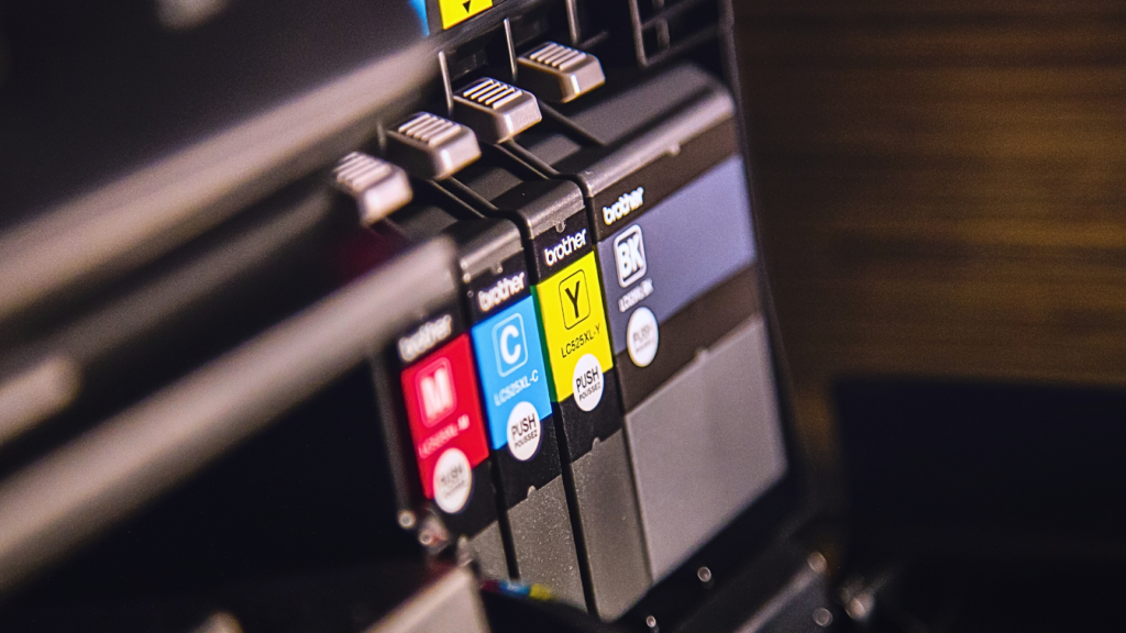
When designing for print, make sure you work in CYMK mode. CYMK stands for Cyan, Yellow, Magenta, and Black; these are the colors printers combine to create the design that’s being printed. Because of the limitations of print and the colors it can produce, there will be some colors that are impossible to recreate in ink. Because of this, some of the colors in your design can appear off if you use colors unavailable in CYMK mode.
When designing for print, make sure you work in CYMK mode. CYMK stands for Cyan, Yellow, Magenta, and Black; these are the colors printers combine to create the design that’s being printed. Because of the limitations of print and the colors it can produce, there will be some colors that are impossible to recreate in ink. Because of this, some of the colors in your design can appear off if you use colors unavailable in CYMK mode.
Bleed and Trim:
Another thing to consider with print ads is the bleed/trim area. Once you design a digital ad, it will appear exactly how you intended it to when you run it in a campaign. This is not the case for print. When your designs get printed, there is a certain amount of the design that is going to bleed off the edges. These edges get cut off by the printing companies, so you have to make sure there is enough room to allow for this bleed without sacrificing your design in the process.
Call to Actions:
For digital ads, you have a lot more flexibility with the call to action. You can ask people to click a link to your website, an article, an application form, etc. However, with a print ad, it’s not as easy as telling someone to click a link. It becomes too complicated to explain to people how to get to an application form in most cases, so the call to action usually becomes a phone number or a website URL they can easily type in.
In both print and digital design, always make sure you’re considering these elements when creating your designs. And with all the designs, make sure you are compelling to your brand guidelines! Happy creating, everyone!
In both print and digital design, always make sure you’re considering these elements when creating your designs. And with all the designs, make sure you are compelling to your brand guidelines! Happy creating, everyone!
